KEN K. MACHARIA
Healthcare Data Analyst
Bridging clinical expertise with data analytics to uncover insights that improve patient outcomes and healthcare delivery.

portfolio projects
OREGON REPORTABLE DISEASES DASHBOARD
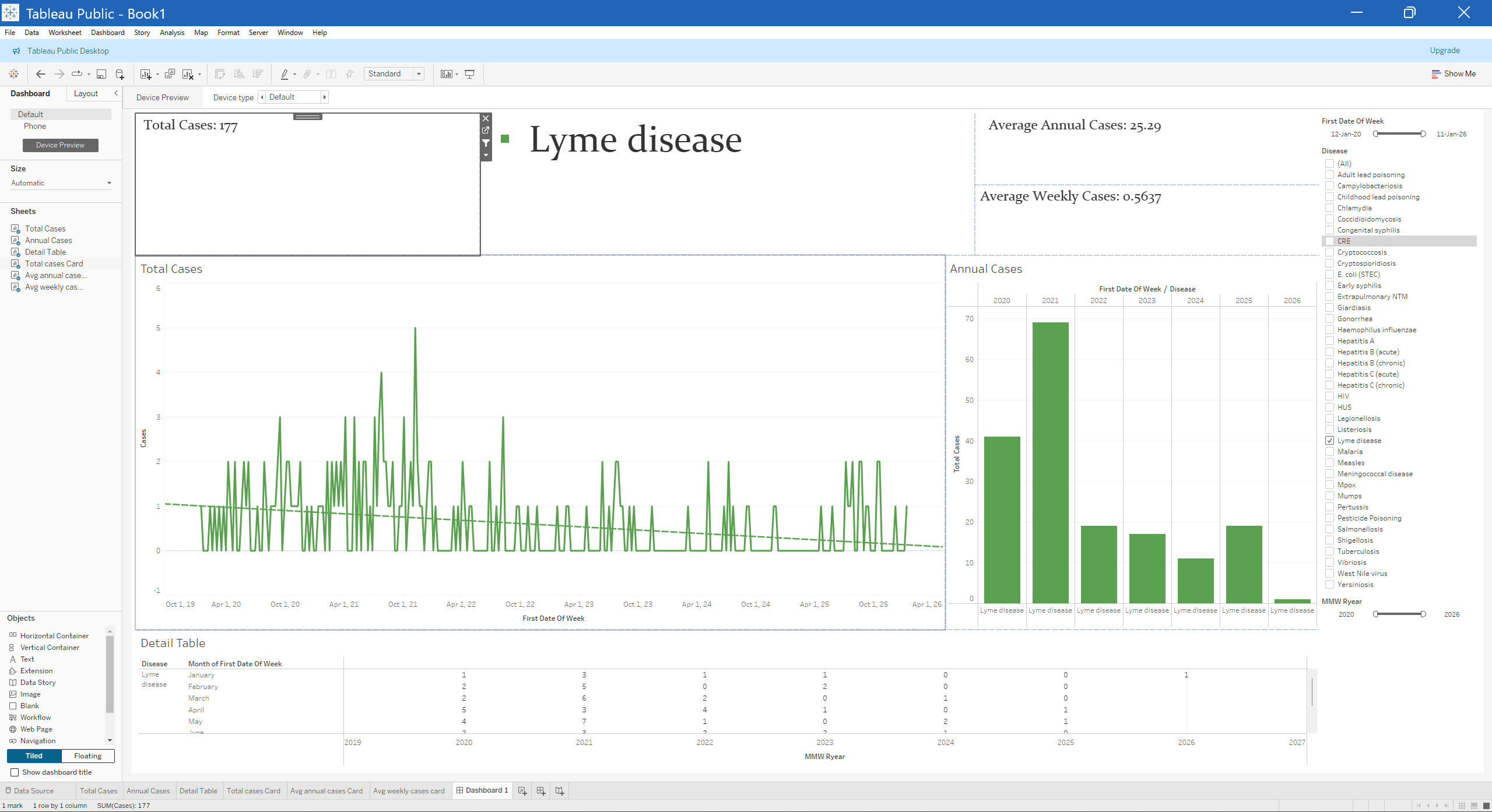
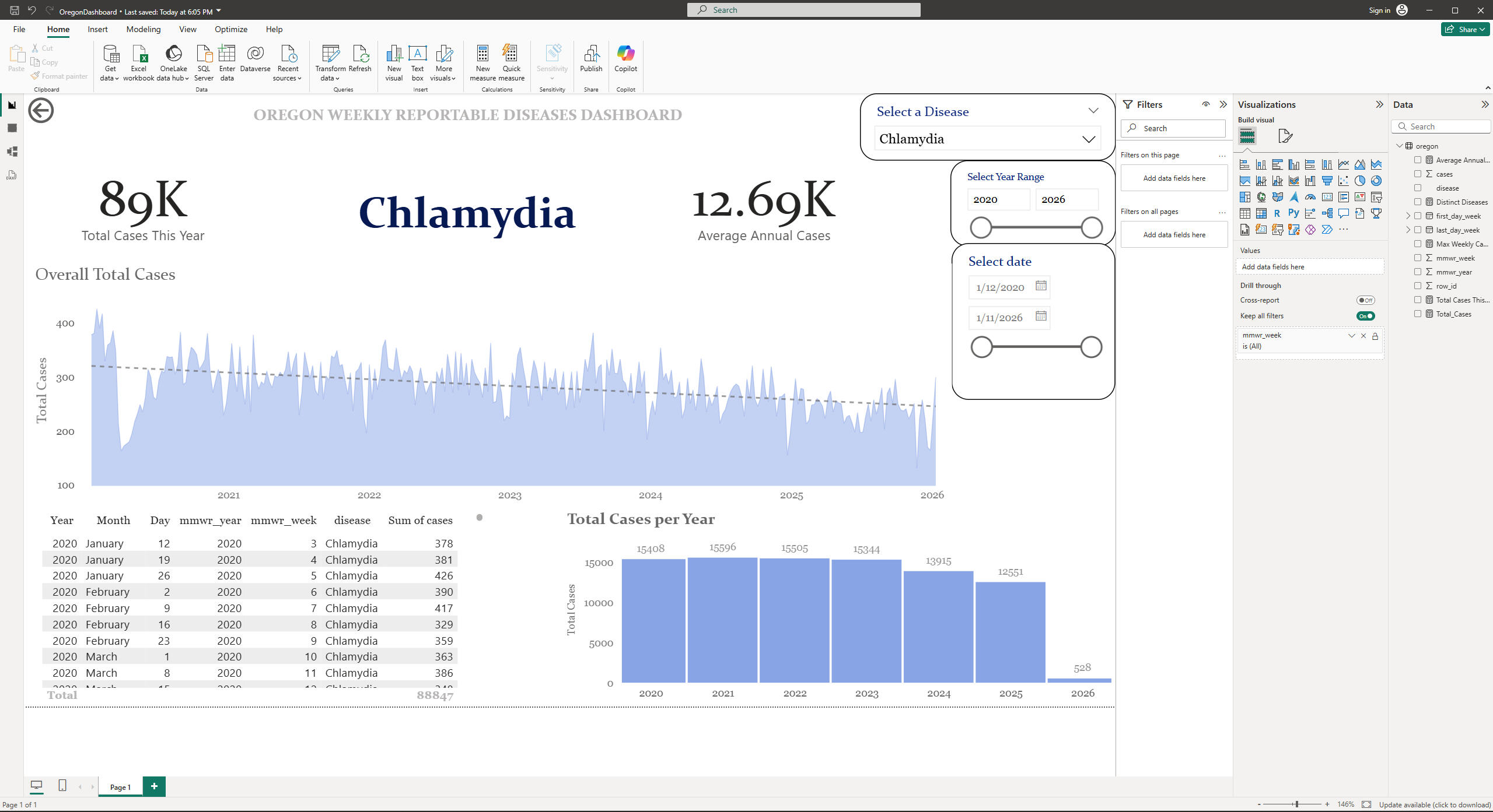
OverviewThis project analyzes weekly reportable communicable diseases in Oregon from 2020–2026 using a time‑series dashboard built on MySQL, Power BI and Tableau.Key InsightsOverall burden: Across all reportable conditions in the dataset, Oregon recorded roughly 176,000 cases between 2020 and early 2026, reflecting a substantial and sustained communicable‑disease burden in the state.
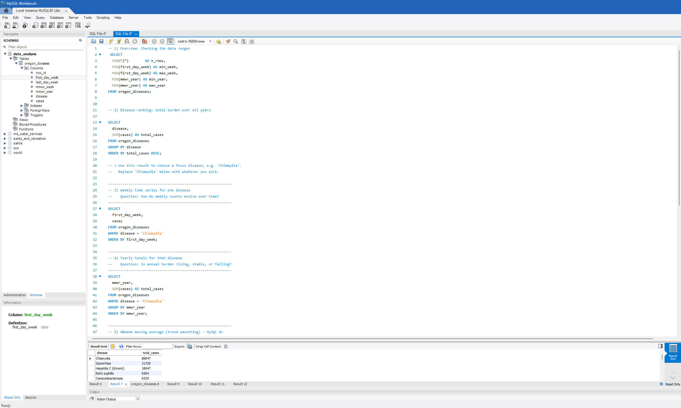
Leading conditions: Sexually transmitted infections (notably Chlamydia and Gonorrhea) and selected enteric infections (such as Campylobacteriosis and Salmonellosis) contribute the largest share of total reported cases, consistently appearing at the top of annual disease rankings.
Year‑to‑year patterns: Annual totals remain high across the period, with modest variation by year; some conditions such as Chlamydia and Gonorrhea show gradual declines or plateaus, while others maintain stable or rising trends when viewed in the yearly bar chart (Tuberculosis and Childhood Lead Poisoning).
Weekly dynamics: Weekly time‑series plots demonstrate persistent baseline transmission for common STIs and recurrent seasonal peaks for several enteric and vector‑borne diseases, with occasional sharp weekly spikes that could be consistent with localized outbreaks or clusters.
Surveillance sensitivity and data quality: The presence of small‑number suppression (“1 to 5” counts), zero‑case weeks for typically rare diseases, and variation in the mix of diseases reported over time highlights both the strengths and limitations of routine surveillance data for fine‑grained epidemiologic inference.Methods & SkillsData source: Weekly Oregon reportable disease surveillance from HealthData.govStorage and cleaning:
The original dataset was cleaned in Excel (date formatting to yyyy-mm-dd) and loaded into a MySQL table oregon_diseases using LOAD DATA LOCAL INFILE for aggregate analysis.
Redundant reporting‑metadata columns were dropped; key columns were retained.
The remaining rows were renamed accordingly and re-coded into the appropriate values..
SQL analysis:
Aggregation queries in MySQL produced total cases by disease, annual totals by disease and year, and weekly time‑series tables exported for visualization.
Visualization stack:
I used Power BI Desktop connected directly to MySQL to import data for the visualization.
A report page was built with cards (total and average annual cases), weekly time‑series line chart with trend line, yearly bar chart, and a detailed table, all controlled by slicers for disease, year, and date.
After building the original dashboard in Power BI, I recreated the same analysis in Tableau Public to show how a solid data model and epidemiologic framing can travel across toolsInterpretation and limitations
The dashboard illustrates how routine surveillance data can be used for quick situational awareness on high‑burden diseases such as Chlamydia, showing both long‑term trends and short‑term fluctuations by week.
The dataset captures reported cases rather than true incidence; under‑diagnosis, under‑reporting, and changes in case definitions or reporting practices over time may influence trends.
Small‑number suppression (e.g., “1 to 5” re-coded to a single value) introduces some uncertainty for low‑incidence diseases but has limited impact on high‑volume conditions.Potential uses and benefits
Routine situational awareness: A weekly, filterable dashboard lets public‑health teams rapidly see which diseases are currently driving the highest burden, how this compares to previous years, and whether unusual spikes are emerging that may require investigation or response.
Early outbreak detection and monitoring: Visualizing weekly time series with trend lines and peaks supports faster recognition of abnormal increases in specific diseases, helping to trigger targeted case finding, contact tracing, or environmental investigations, and to monitor whether interventions are reducing incidence over subsequent weeks.
Forecasting and planning: Exporting the weekly aggregated data from this dashboard into statistical tools (Python, R) allows time‑series models (e.g., ARIMA, exponential smoothing) to be fit and forecast future case counts, supporting resource planning for clinics, laboratories, and public‑health programs.
Methodological template for other jurisdictions: The pipeline—cleaning reportable disease data, storing it in a relational database, and building an interactive BI dashboard—is generalizable and can be replicated for other U.S. states, Kenyan counties, or hospital systems using their own surveillance datasets, enabling more standardized disease intelligence across settings.
Communication and advocacy: Simple, intuitive visuals (trend lines, yearly bars, and KPI cards) make it easier to communicate disease trends to non‑technical stakeholders such as hospital leadership, local health authorities, or policymakers, helping justify investments in screening, vaccination, and prevention programs.
HEALTHCARE ADVANCED APPOINTMENTS
A Deep Dive into Patient, Clinical, and Financial Operations
By: Ken K. Macharia — Healthcare Data Analyst
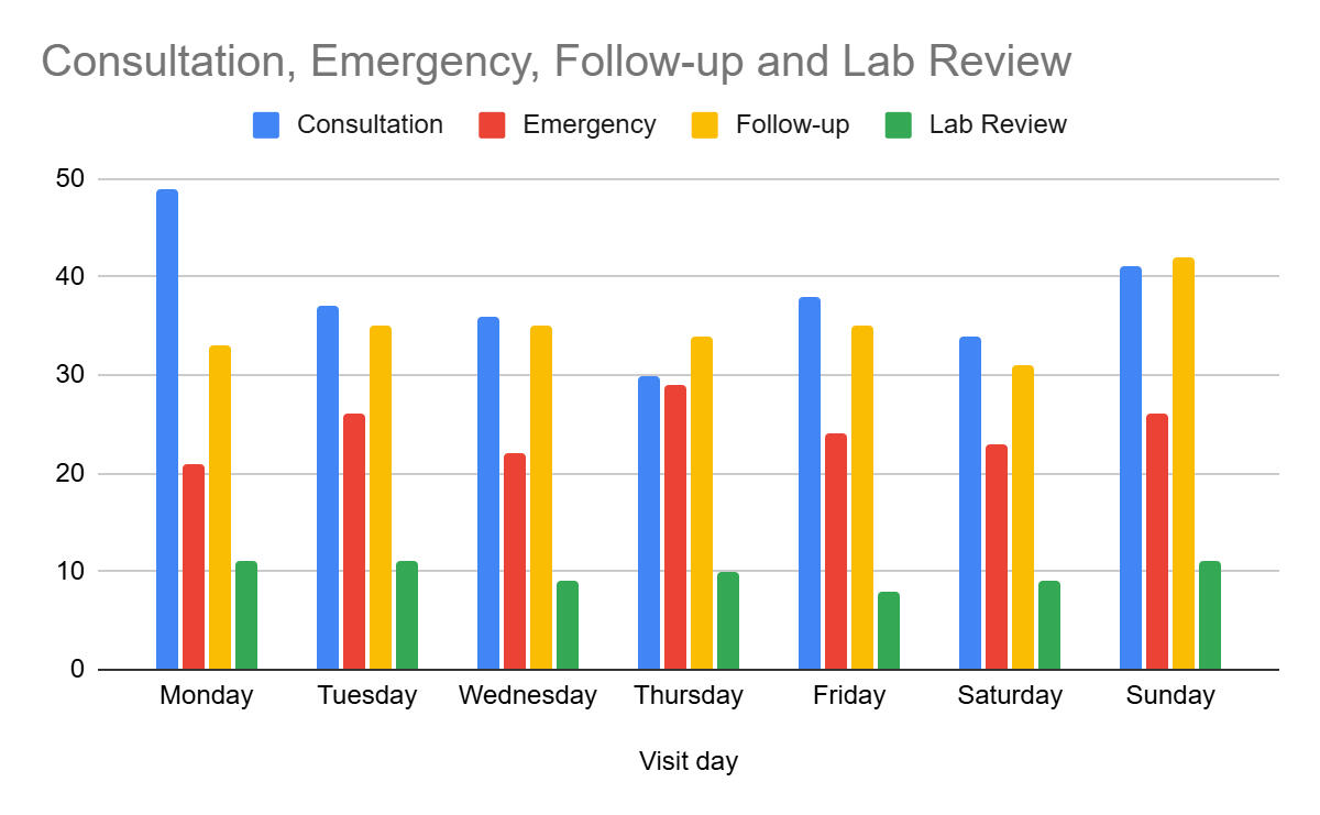
Tools: Google Sheets · Pivot Tables · Conditional Formatting · Basic StatisticsOverviewAnalyzed 750 simulated outpatient records from HealthFirst Clinic to uncover patterns in appointment attendance, clinician efficiency, and financial performance.
The goal was to identify workflow gaps and improve both care delivery and revenue management through data-driven insights.Key InsightsPayment completion varied by insurance type; publicly insured patients had the lowest payment rates.Older patients (56–60, 89+) missed more appointments and underpaid more often.Over 20% of appointments had time discrepancies of eight minutes or more.Clinician workloads were uneven, with some showing higher billing inconsistencies.Public insurance was the most used, especially toward the end of the week.Methods & SkillsAdvanced data cleaning using ARRAYFORMULA, SWITCH, and IFSFeature engineering (age bins, payment gaps, discrepancy flags)Pivot-table exploration and conditional formattingVisual storytelling to link operational data with practical improvementsRecommendationsStrengthen reminders for elderly and uninsured patients.Add pre-visit payment verification and post-visit follow-up.Rebalance clinician schedules to reduce time gaps and fatigue.Adjust weekend scheduling to improve punctuality and efficiency.ReflectionThis project expanded my ability to perform full-cycle analysis in Google Sheets — from raw data cleaning to operational insights — reinforcing how small-scale analytics can drive measurable improvements in healthcare delivery
USA MORTALITY 2011-2013
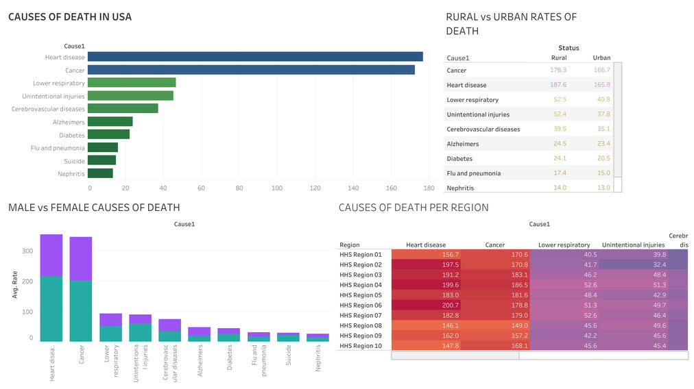
OverviewA data visualization project exploring mortality patterns across the United States between 2011 and 2013.
Using Tableau, the dashboard reveals how causes of death vary by age, sex, and rural–urban classification. The goal was to communicate public health disparities through clear, interactive visuals that make complex data accessible.Key InsightsChronic diseases such as heart disease and cancer remained the leading causes of death across all demographics.Rural populations experienced consistently higher mortality rates, particularly among middle-aged and older males.External causes (accidents, injuries) were more common among younger age groups.Marked regional and demographic disparities highlight the need for targeted public health strategies.Methods & Skills
Data cleaning and transformation for Tableau import.Visual exploration of multi-dimensional data (age, sex, cause, and geography).Dashboard design emphasizing clarity, interactivity, and comparative analysis.Data storytelling to reveal health inequalities behind national averages.RecommendationsStrengthen preventive care programs targeting chronic conditions in rural areas.Develop age- and gender-specific safety interventions to reduce external-cause mortality.Use data-driven communication to inform equitable health policy and resource distribution.ReflectionsThis project reinforced my understanding of how visualization transforms raw data into public insight. I learned to balance aesthetic simplicity with analytical depth, ensuring that every chart contributes to a coherent narrative about population health disparities.
About
I’m a Medical Officer and Health Data Analyst passionate about transforming healthcare decisions through data. My background in clinical medicine grounds my analytical work in real-world patient challenges, while my growing expertise in Excel, Google Sheets, Tableau, Power BI, SQL and predictive modeling helps translate complex datasets into actionable insights.I focus on building dashboards and analytical tools that help healthcare systems run smarter, not harder — delivering clarity where it’s needed most. Continuously learning, I am experimenting and collaborating on projects that bridge medicine, analytics, and impact.
My Skills
Analytical thinking
Collaboration & communication
Problem-solving
Adaptability & continuous learning
Data analysis & visualization
Statistical reasoning
Pivot tables
Data storytelling
Thank you
Thanks for visiting my portfolio. If you’re exploring healthcare analytics or data-driven projects, I’d love to exchange ideas and learn from your work too. Collaboration is how good insights become great outcomes.